flex 水平垂直居中 css
display: flex;
align-items:center;
justify-content:center;
其他参考:
一、flex-direction: (元素排列方向)
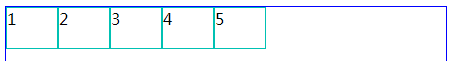
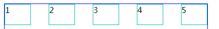
※ flex-direction:row (横向从左到右排列==左对齐)
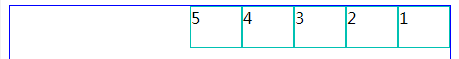
※ flex-direction:row-reverse (与row 相反)
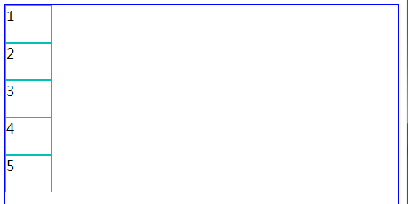
※ flex-direction:column (从上往下排列==顶对齐)
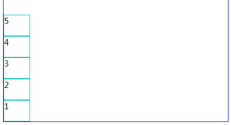
※ flex-direction:column-reverse (与column 相反)
二、flex-wrap: (内容一行容不下的时候才有效)
※ flex-wrap:nowrap (超出不换行,很奇怪里面的宽度会变成100%)
※ flex-wrap:wrap (超出按父级的高度平分)

※ flex-wrap:wrap-reverse(与wrap 相反)

三、justify-content: (水平对齐方式)
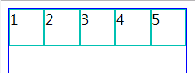
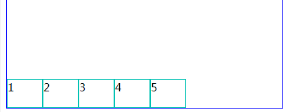
※ flex-start (水平左对齐)
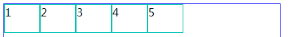
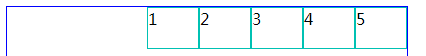
※ justify-content:flex-end; (水平右对齐)
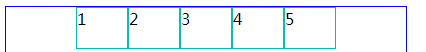
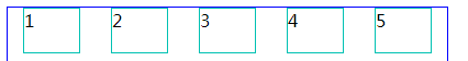
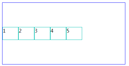
※ justify-content:center; (水平居中对齐)
※ justify-content:space-between; (两端对齐)
※ justify-content:space-around; (两端间距对其)
四、align-items: (垂直对齐方式)
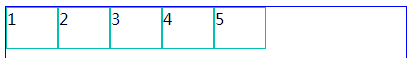
※ align-items:stretch; (默认)
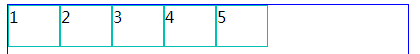
※ align-items:flex-start; (上对齐,和默认差不多)
※ align-items:flex-end; (下对齐)
※ align-items:center;(居中对齐)
※ align-items:baseline; (基线对齐)
还没搞明白基线对齐是什么意思。
以上是对flex的简单介绍。下面有个小例子,
大家经常用到的,某个div里面水平垂直居中,
