微信小程序——自定义图标组件
字体图标在网页中非常常见了。为了方便在小程序里面重复使用,自定义了一个图标组件,方便控制它的大小,颜色,自定义点击事件。
自定义图标组件的代码如下:
下面的代码是icon文件夹下面的4个文件
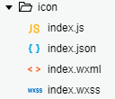
index.wxml:

<view  class="custom-class ss-font ss-icon-{{ name }}"
  style="{{ color ? 'color: ' + color : '' }}; {{ size ? 'font-size: ' + size : '' }}"
  bind:tap="onClick">
  <view wx:if="{{ info !== null }}" class="ss-icon__info">{{ info }}</view></view>
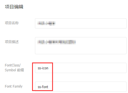
上面的 ss-font 和 ss-icon 是根据你在阿里巴巴图标库项目中自定义的,我的如下图:
index.js:
Component({
  options: {
    addGlobalClass: true
  },

  externalClasses: ['custom-class'],

  properties: {
    info: null,
    name: String,
    size: String,
    color: String
  },

  methods: {
    onClick() {      this.triggerEvent('click');
    }
  }
});
上面如果理解有困难的可以先看一下小程序组件介绍大概了解一些基本概念。
index.json:
{ "component": true}
index.wxss:
/**
这里放你的所有图标的代码
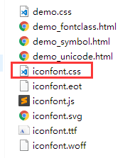
在阿里巴巴矢量库,选择 Unicode 模式,下载解压后的iconfont.css里面的代码,下面有截图可供参考
**/.ss-icon__info {
color: #fff;
left: 100%;
top: -.5em;
font-size: 0.5em;
padding: 0 0.3em;
text-align: center;
min-width: 1.2em;
line-height: 1.2;
position: absolute;
border-radius: 0.6em;
box-sizing: border-box;
background-color: #f44;
-webkit-transform: translateX(-50%);
transform: translateX(-50%);
font-family: PingFang SC, Helvetica Neue, Arial, sans-serif;
}

API:
| 参数 | 说明 | 类型 | 默认值 |
|---|---|---|---|
| name | 图标名称 | String | - |
| info | 图标右上角文字提示 | String | Number | - |
| color | 图标颜色 | String | inherit |
| size | 图标大小,如 16px,1em | String | inherit |
| custom-style | 自定义样式 | String | - |
使用方法:
在index.json引入该组件:
"usingComponents": { "ss-icon": "/components/icon/index"}
设置name属性为对应的图标名称即可。
<ss-icon name="tel" />
这些图标就是你自己定义的。像我下面的电话图标:

像什么颜色,大小的配置可以查看上面的API表格。这里就不一一赘述了~